
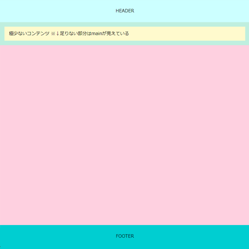
//DEMOページの色分け
body { background: #fff; }
header { background: #cff; }
main { background: #fedee9; }
footer { background: #00ced1; }
section { background-color: #bfefdf; }
article { background-color: #fffacd; }
フッタの下部固定方法
フッタの下部固定:1
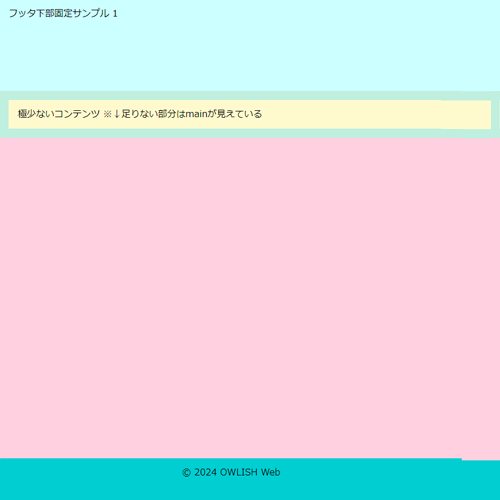
<body>

	<header> HEADER </header>

	<main> CONTENTS </main>

	<footer> FOOTER </footer>

</body>
- CSSはこちら
-
body {
	display: flex;
	flex-direction: column;
	width: 100%;
	min-height: 100vh;
	margin: 0;
	padding: 0;
	}
header {
	position: relative;
	width: 100%;
	height: 10rem;
	margin: 0 auto;
	}
main {
	flex: 1 1 auto;
	position: relative;
	width: 100%;
	margin: 0 auto;
	}
footer {
	width: 100%;
	height: 5rem;
	margin: 0 auto;
	}
CLOSE
フッタの下部固定:2
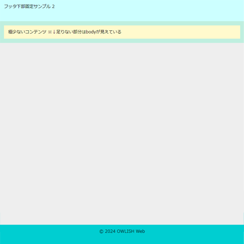
<body>

	<header> HEADER </header>

	<main> CONTENTS </main>

	<footer> FOOTER </footer>

</body>
- CSSはこちら
-
html {
	height: 100%;
	}
body {
	height: 100%;
	}
footer {
	position: sticky;
	top: 100vh;
	height: 5rem;
	}
header {
	height: 5rem;
	}
CLOSE
フッタの下部固定:3
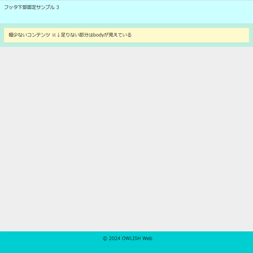
<body>

	<div id="container">
		<header> HEADER </header>
		<main> CONTENTS </main>
	</div><!--//container-->

	<footer> FOOTER </footer>

</body>
- CSSはこちら
-
html {
	height: 100%;
	}
body {
	display: flex;
	flex-direction: column;
	min-height: 100%;
	margin: 0;
	padding: 0;
	}
#container {
	flex: 1;
	}
header {
	width: 100%;
	height: 5rem;
	}
footer {
	width: 100%;
	height: 5rem;
	}
CLOSE
フッタの下部固定:4
<body>
	<div class="container">
		<header> HEADER </header>

		<main> CONTENTS </main>

		<footer> FOOTER </footer>
	</div><!--//container-->

</body>
- CSSはこちら
-
header {
	height: 80px;
	display: flex;
	justify-content: center;
	align-items: center;
	position: sticky;
	top: 0;
	}

.container {
	min-height: 100vh;
	display: flex;
	flex-direction: column;
	}

main {
	flex: 1;
	}

footer {
	height: 80px;
	display: flex;
	justify-content: center;
	align-items: center;
	}
CLOSE
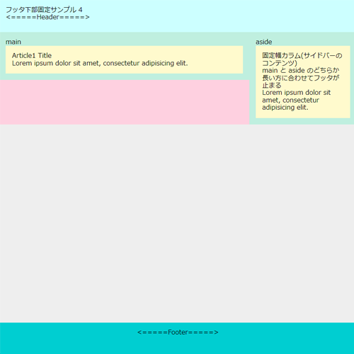
フッタの下部固定 (2Column) :5
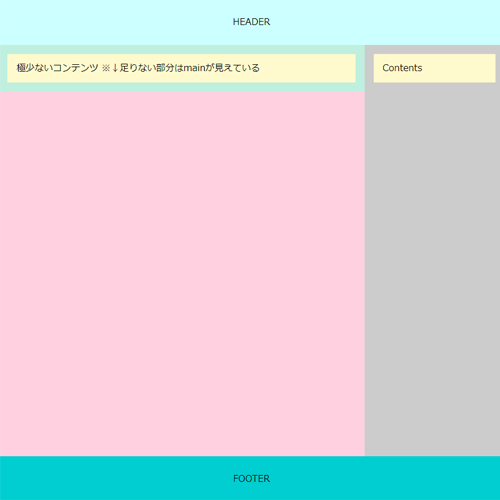
<body>
	<div class="container">
		<header> HEADER </header>

		<div class="contents">
			<main> CONTENTS </main>
			<aside> SIDE MENU </aside>
		</div><!--//contents-->

		<footer> FOOTER </footer>
	</div><!--//container-->

</body>
- CSSはこちら
-
header {
	height: 80px;
	display: flex;
	justify-content: center;
	align-items: center;
	position: sticky;
	top: 0;
	}

.container {
	min-height: 100vh;
	display: flex;
	flex-direction: column;
	}

.contents {
	flex: 1;
	display: flex;
	flex-direction: row;
	}

main {
	flex: 3;
	}

aside {
	flex: 1;
	padding: 1rem;
	}

footer {
	height: 80px;
	display: flex;
	justify-content: center;
	align-items: center;
	}
CLOSE
フッタの下部固定(2Column) :6
<body>

	<header> HEADER </header>

	<div id="container">
		<main> CONTENTS </main>
		<aside> SIDE MENU </aside>
	</div><!--//container-->

	<footer> FOOTER </footer>

</body>
- CSSはこちら
-
html {
	height: 100%;
	}
body {
	height: 100%;
	}
footer {
	position: sticky;
	top: 100vh;
	height: 5rem;
	text-align: center;
	}
header {
	height: 5rem;
	}

#container {
	display: flex;
	flex: 1;
	width: 100%;
	max-width: 1920px;
	margin: 0 auto;
	}
main {
	flex: 1 1 auto;
	min-width: 70%;
	}
aside {
	flex: 0 0 30%;
	}

/*[ Media Query ] --------------------------- */
@media screen and (max-width: 767.9px) {
	#container {
		display: block;
		}
	}
CLOSE